Why Every Web Project Needs a Style Guide

Senior WebCoder
Imagine you’re building a house. Would you start laying bricks before you pick the blueprint, the paint colors, and the overall design? Probably not.
Web design is no different.
Before a single pixel is placed or a layout is coded, the foundation of any successful design project is the style guide — a visual blueprint that ensures consistency, clarity, and confidence from start to finish.
Whether you're a client or a new designer, this guide will walk you through:
- What a style guide is (and isn’t)
- Why it’s essential
- How it helps throughout the project
- What a real-world style guide includes — explained simply
What Is a Style Guide?
A style guide is a document (often digital) that defines how your brand looks and feels across web and digital platforms. Think of it as a rulebook for design — covering colors, typography, spacing, button styles, logo usage, and more.
It brings visual consistency, improves team collaboration, and helps your brand look professional no matter who’s designing or developing.
Analogy: Your Brand’s Mirror
If your brand were a person, the style guide is its mirror — reflecting its fashion sense, personality, tone, and attitude. It ensures that whether it's day one or year ten, your brand always "shows up" in the right outfit.
Why Style Guides Matter (Even Before You Start)
Here’s why creating a style guide before starting a web design project is critical:
1. Saves Time and Redesigns
Without a clear visual direction, designers often go back and forth on colors, fonts, or button shapes. A style guide makes these decisions upfront — so the project flows faster.
2. Ensures Brand Consistency
Your website, social media, email campaigns, and landing pages should all look like they belong to the same family. A style guide avoids the “Frankenstein effect” of mismatched design.
3. Empowers Teams
Whether it’s one designer or five, everyone works from the same visual playbook. Developers, marketers, and even content writers can align their work to your brand visuals.
4. Helps Clients Visualize
For clients, a style guide gives an early sneak peek at the brand’s visual tone — so they can approve or tweak before deeper work begins.
How It’s Used Throughout the Project Lifecycle
| Phase | How the Style Guide Helps |
|---|---|
| Discovery | Defines the brand mood early on |
| Wireframes | Informs layout spacing, font hierarchy |
| UI Design | Used to style every page element |
| Development | Developers reference exact specs |
| QA & Feedback | Makes it easy to spot inconsistencies |
| Post-launch | Future designers or teams follow it too |
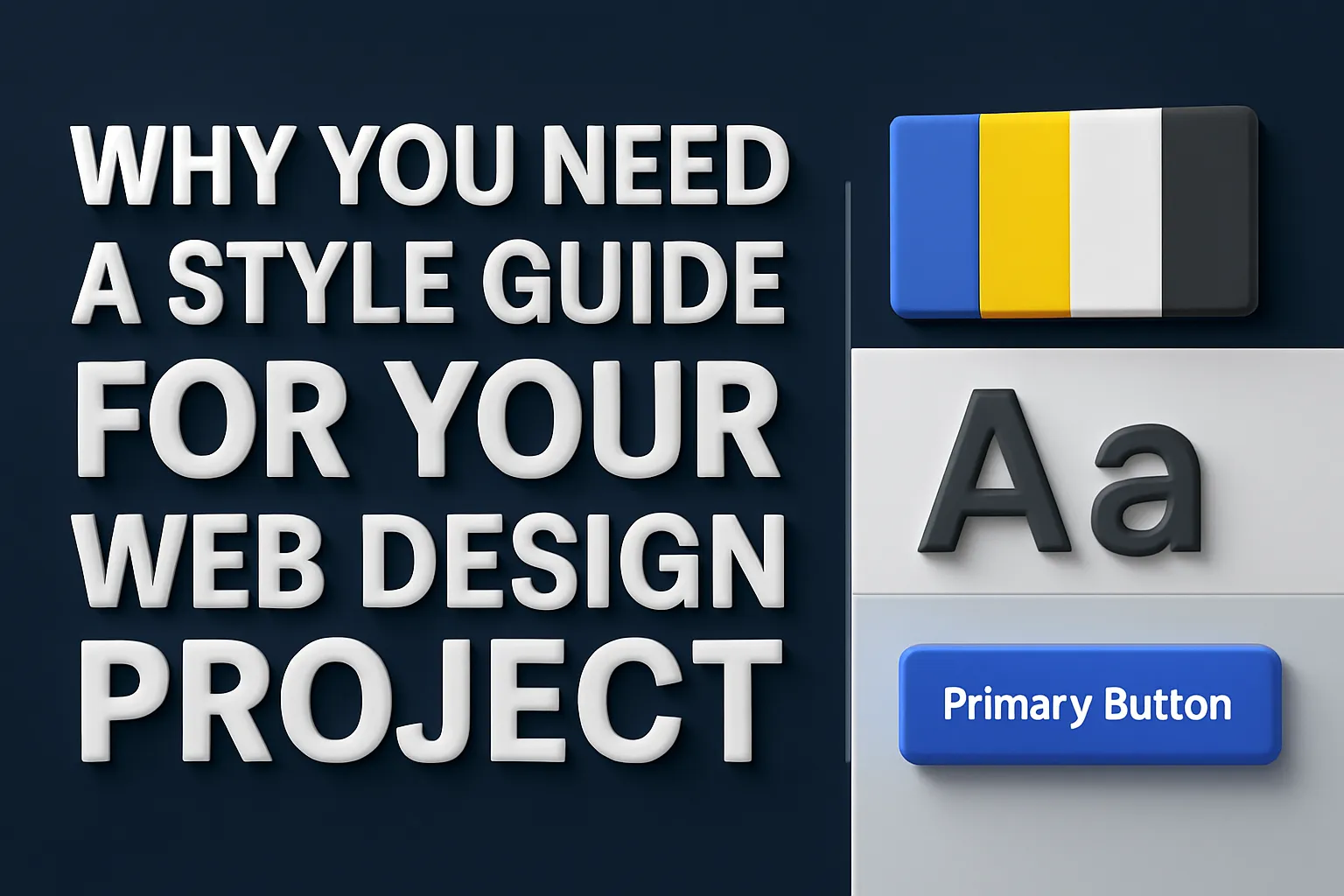
What a Practical Style Guide Includes
Let’s walk through a practical style guide — section by section — and explain what’s must-have and what’s medium priority.
Must-Have Items in a Style Guide
Color Palette
- Primary Colors: The brand’s core colors — used for backgrounds, headers, and key elements.
- Secondary Colors: Accents that complement the primary colors (buttons, hover states).
- Neutral Colors: Greys, whites, blacks used for text, backgrounds, and dividers.
Tip: Always show HEX, RGB, or HSL codes — designers and developers need exact values.
Typography Rules
- Primary Font: For headers (e.g., Montserrat Bold).
- Secondary Font: For body text (e.g., Open Sans Regular).
- Font Sizes and Weights: H1 to H6, body text, captions — with pixel or rem values.
- Line Height / Letter Spacing: Ensures readability across devices.
Example:
- H1: 48px, Montserrat Bold
- Body: 16px, Open Sans, Line Height 1.6
Grid & Spacing System
- Columns and Gutters: E.g., 12-column grid, 24px gutter.
- Spacing Scale: Margin and padding guidelines like 4px, 8px, 16px, 32px.
Ensures consistent layout spacing across pages.
Buttons & CTAs
- Primary and secondary button styles
- Hover states, disabled states, icon usage
Include corner radius, font size, padding, shadow effects if any.
Logo Usage
- Correct logo versions (horizontal, stacked, monochrome)
- Clear space rules (e.g., don’t crowd the logo)
- Incorrect usage examples (e.g., don’t stretch, recolor, or add effects)
Medium Priority (Nice to Have) Items
Brand Voice & Tone
- Defines how your brand sounds in writing: Friendly? Professional? Playful?
- Useful for content creators and social media teams.
Form Elements
- Input fields, dropdowns, toggles — styled versions with focus/active states.
Icon Style
- What type of icons to use (outlined, filled, stroke width)
- Source references (custom or from libraries like FontAwesome)
Navigation & Footer Guidelines
- Desktop vs. mobile menu styling
- Footer layout, background color, and link style
Component Library (for advanced teams)
- Pre-designed components like cards, modals, tabs — with variants.
A Mini Style Guide Example
Color Palette
- Primary:
#1A73E8(Blue) - Secondary:
#F9AB00(Amber) - Background:
#FFFFFF - Text:
#202124
Typography
- Heading Font: Poppins Bold
- Body Font: Roboto Regular
- H1: 36px, Line Height: 1.4
- Body: 16px, Line Height: 1.6
Buttons
- Primary Button: Blue background, white text, 12px padding, 4px radius
- Hover: Darker blue background
- Disabled: Grey background, 50% opacity
Logo Usage
- Horizontal logo on white background
- 40px clear space around logo
- Never rotate or recolor
Final Thoughts: Start Smart, Design Smarter
Starting your web design project with a style guide is not a delay — it’s a smart shortcut.
It avoids chaos, reduces rework, and makes sure everyone is aligned from day one. Whether you’re a startup founder, an agency client, or a freelance designer, a style guide is your project’s north star.
So before you jump into design — take a step back, create your guide, and watch how much smoother (and prettier) the journey becomes.
Want Help Creating Your Brand's Style Guide?
If you’re unsure how to start or want a designer to create a professional style guide for your website or product, feel free to reach out. We help clients and teams craft style guides that scale — visually and strategically.
Soundiraraj Moorthy
Senior WebCoder
Soundiraraj Moorthy is a Senior WebCoder at FUEiNT, contributing expert insights on technology, development, and digital strategy.