F-Pattern Thinking: UX for the Way People Read
On an average web page, people read at most 28% of the words — and often closer to 20%. Instead of consuming every line, users scan. Their eyes move in a pattern that resembles the letter “F.”
First observed in Nielsen Norman Group’s eye-tracking studies (2006), this discovery has shaped how designers structure text-heavy pages. For anyone creating web content, the F-pattern is both a peek into user behavior and a blueprint for more engaging, effective design.
What is the F-Shaped Pattern?
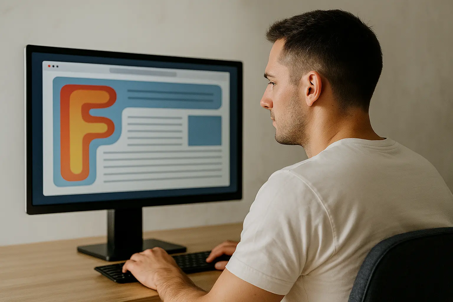
The F-pattern describes how users’ eyes typically move across online content:
-
First horizontal scan: Across the top of the content area.
-
Second horizontal scan: Slightly lower, but shorter.
-
Vertical scan: Down the left margin, glancing at beginnings of lines.
This creates two horizontal stripes and one vertical stripe — forming an “F.”
Why? Because users are often in a hurry. As Jakob Nielsen summed up: “F for fast.” People skim for keywords and clues, not for detailed reading.

Why It Matters for UX
If users are going to scan anyway, design should work with this behavior — not against it.
-
Critical information must sit where eyes linger first: the top and left.
-
Buried content, long paragraphs, or vague headlines are often invisible to scanners.
-
Ignoring the F-pattern risks missed CTAs, overlooked messages, and lost engagement.
One site that leverages this brilliantly is BBC News. Headlines start at the left margin, bold and concise. Lists of secondary stories run vertically down the left. Images support but don’t disrupt scanning. The result: high engagement and clarity that matches how people naturally read.

Designing for the F-Pattern: Practical Tips
Here’s how to turn research into action:
🔝 Front-load information
-
Put the most important content in the first two paragraphs.
-
Start sentences, headings, and bullets with informative keywords.
📝 Use left-aligned headings and subheadings
-
Clear, descriptive headings guide horizontal and vertical scans.
-
Avoid vague titles — “Quarterly Revenue Results” works better than “How Did We Do?”
📰 Establish visual hierarchy
-
Headlines should stand out with size and weight.
-
Place navigation and CTAs near top or left — natural scan zones.
⬜ Chunk text for scanning
-
Break walls of text into short paragraphs, bullets, or sub-sections.
-
Bullets are especially powerful: concise, left-aligned, and easy to skim.
👀 Design for the gaze path
-
Position key elements (menus, headlines, images) where eyes travel: top and left.
-
Remember: content high on the page gets far more views than content below the fold.
📏 Leverage whitespace and separators
-
Clean layouts help users reset their eyes and start a new scan.
-
Group related content into clear, digestible sections.
The Empathy Behind F-Pattern Design
Designing for the F-pattern isn’t about forcing users into a rigid eye path — it’s about respecting their time.
Users are busy, distracted, and selective. By aligning with natural scanning behavior, you:
-
Help users find what matters faster.
-
Increase engagement and comprehension.
-
Create experiences that feel effortless and intuitive.
When design meets real behavior, content feels user-friendly without users knowing why. And that’s good UX: invisible, empathetic, and effective.

Final Thoughts
The F-pattern shows us a truth about digital behavior: people don’t read, they scan.
Great UX embraces this reality. It puts value upfront, makes scanning rewarding, and gently guides attention toward what matters most.
So, the next time you’re designing a page, picture that invisible “F” your users will trace. Then ask:
-
Will a rushed reader still see the key points?
-
Are my headlines clear and front-loaded?
-
Are my calls to action placed where scanning eyes will land?
Design this way, and you’ll earn more than just views. You’ll earn trust, engagement, and repeat visits — because your design respects your users’ most precious resource: their attention.

Kala M
Designer
UI/UX Designer who believes in data-driven design. Transforming complex user flows into intuitive, accessible, and beautiful interfaces.