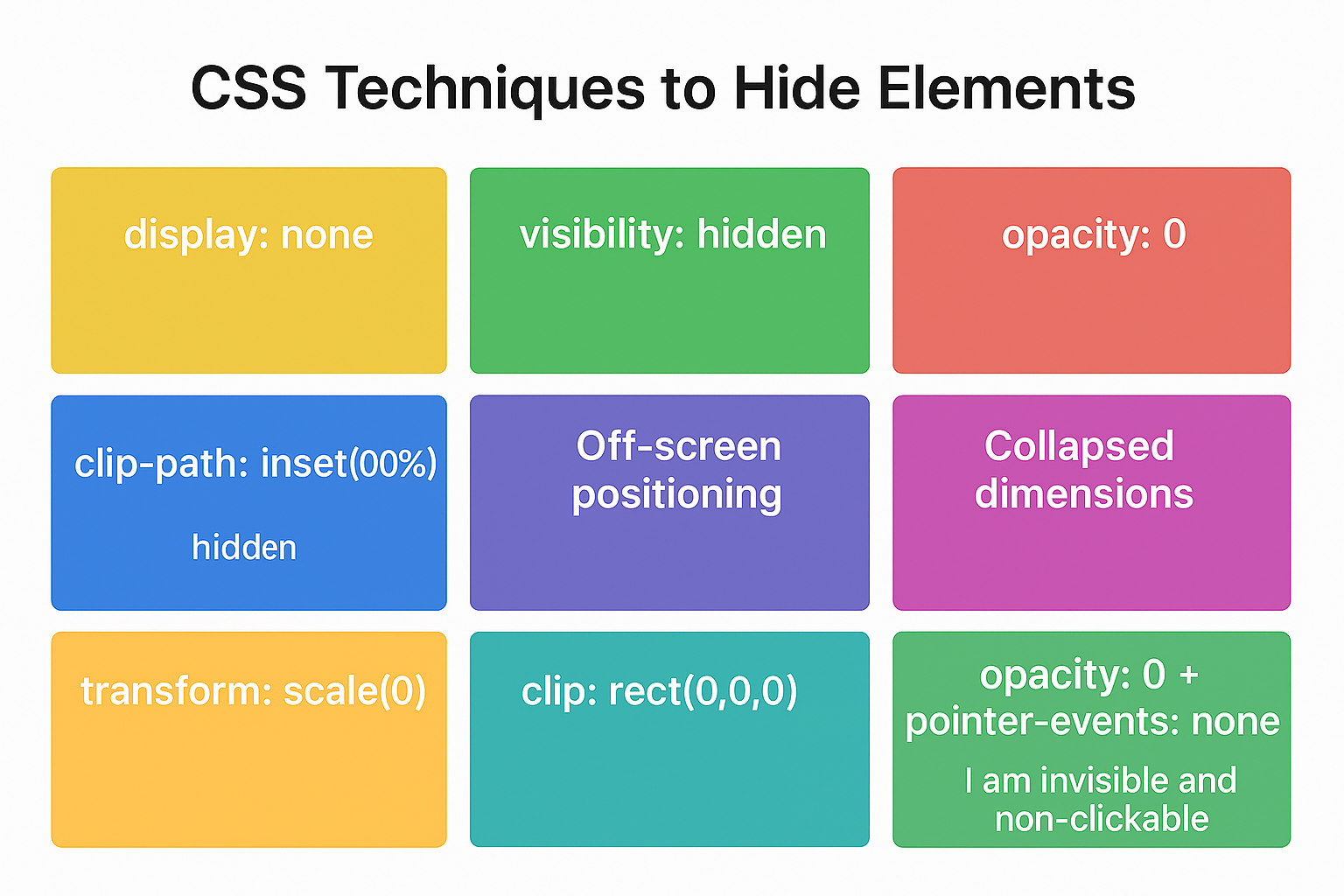
CSS Techniques to Hide Elements – Detailed Explanation

Senior WebCoder

In CSS, there are several ways to hide elements, each with different effects on layout, interactivity, and animations. Choosing the right method depends on whether you want the element to occupy space, remain interactive, or allow smooth animations.
1. display: none
The display: none property completely removes an element from the page layout. The element does not occupy any space, and other elements reflow as if it doesn’t exist. It is also non-interactive, meaning users cannot click or focus on it. Since the element is entirely removed, CSS transitions cannot animate its appearance directly. This technique is ideal for conditionally showing or hiding content such as modals, dropdown menus, or sections that should appear only on user interaction.
Example:
<div class="box1">I am visible</div>
<div class="box2" style="display: none;">I am hidden</div>
2. visibility: hidden
Unlike display: none, the visibility: hidden property makes an element invisible while preserving its space in the layout. It cannot be clicked or focused, but surrounding content does not shift, making it useful for tooltips, placeholders, or temporarily hidden elements. It can also be combined with opacity to create smooth fade-in/out animations.
Example:
<div class="box1">I am visible</div>
<div class="box2" style="visibility: hidden;">I am invisible but space reserved</div>
3. opacity: 0
Setting opacity: 0 makes an element fully transparent while keeping it in the layout and in the DOM. Unlike visibility: hidden, the element remains interactive unless pointer-events: none is applied. This makes opacity ideal for animations, such as fading in or out modals, tooltips, or buttons. By combining opacity with transitions, you can create smooth visual effects.
Example:
<div class="box1">I am visible</div>
<div class="box2" style="opacity: 0;">I am transparent but clickable</div>
4. clip-path: inset(100%)
The clip-path property allows you to mask elements, effectively hiding them visually while preserving their space. The element becomes non-interactive, similar to visibility: hidden. A major advantage is the ability to animate the clip-path property, creating dynamic reveal effects. This technique is often used in modern web animations and interactive UI components.
Example:
<div class="box1">I am visible</div>
<div class="box2" style="clip-path: inset(100%);">I am hidden via clip-path</div>
5. Off-screen positioning (position: absolute; left: -9999px)
This method hides an element by moving it far outside the visible viewport. While invisible to users, the element still exists in the DOM and is accessible to screen readers. This technique is commonly used for accessibility, hidden ARIA labels, or SEO content that should not appear visually but needs to be read by assistive technologies.
Example:
<div class="box1">I am visible</div>
<div class="box2" style="position: absolute; left: -9999px;">I am off-screen</div>
6. Collapsed dimensions (height: 0; width: 0; overflow: hidden)
By collapsing an element’s height and width to zero and hiding its overflow, the content is effectively hidden and occupies minimal space. This technique is often used in accordions, collapsible menus, or sections that expand dynamically. Unlike display: none, it allows smooth animation of height or width for a sliding effect.
Example:
<div class="box1">I am visible</div>
<div class="box2" style="height: 0; width: 0; overflow: hidden;">I am collapsed</div>
7. transform: scale(0)
Using transform: scale(0) shrinks an element to zero size visually. The element may still occupy space depending on its container, and it can be animated to scale up smoothly. This approach is widely used for tooltips, popups, or animated buttons because it combines well with opacity transitions for a fade-and-scale effect.
Example:
<div class="box1">I am visible</div>
<div class="box2" style="transform: scale(0);">I am scaled to zero</div>
8. clip: rect(0,0,0,0) (legacy)
The clip property, primarily used in older browsers, defines a rectangular clipping region to hide elements visually. While the element remains in the layout, it is non-interactive. Modern web development favors clip-path for better animation and cross-browser support.
Example:
<div class="box1">I am visible</div>
<div class="box2" style="clip: rect(0,0,0,0); position: absolute;">I am hidden via clip</div>
9. opacity: 0 + pointer-events: none
Combining full transparency with pointer-events: none ensures the element is both invisible and non-interactive, while still occupying space. This method is excellent for UI elements that need smooth transitions while preventing user interaction during animations.
Example:
<div class="box1">I am visible</div>
<div class="box2" style="opacity: 0; pointer-events: none;">I am invisible and non-clickable</div>
Conclusion
CSS provides multiple ways to hide elements, each with specific advantages. display: none removes an element completely, affecting layout and interactivity. visibility: hidden preserves layout space while making the element invisible. opacity: 0 allows smooth fade animations and can remain interactive. Advanced techniques like clip-path, off-screen positioning, collapsed dimensions, or transform: scale(0) provide greater flexibility for animations and accessibility. Choosing the right method depends on whether layout, interactivity, animation, or accessibility is a priority.

Gokila Manickam
Senior WebCoder
Gokila Manickam is a Senior WebCoder at FUEiNT, contributing expert insights on technology, development, and digital strategy.
