Essential HTML Sections Guide
A comprehensive guide to key website sections with implementation examples.
Understanding Website Structure
Modern websites follow established structural patterns that users intuitively understand. These HTML sections work together to create a cohesive user experience.
- Header: Persistent top section with navigation
- Hero: Attention-grabbing introductory area
- Content Areas: Organized information sections
- CTAs: Strategic action prompts
- Footer: Bottom supplementary section
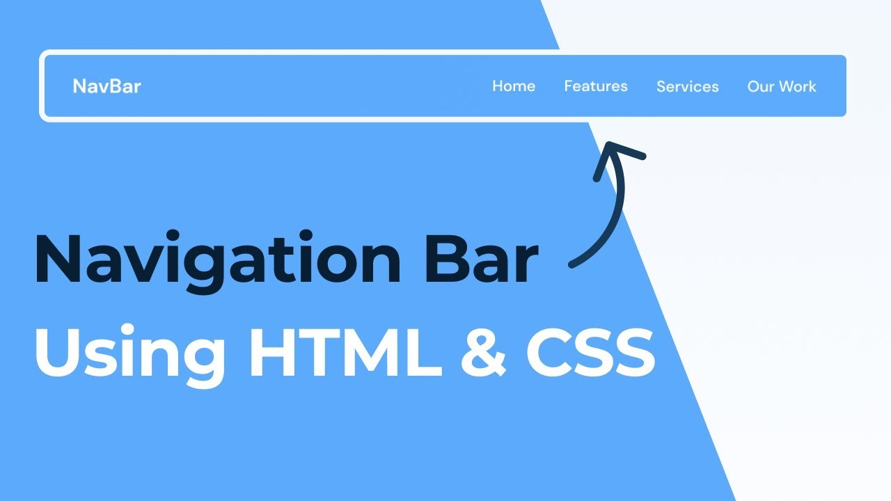
Header Section
Definition
The persistent navigation and branding element at the top of every page that establishes brand recognition and provides primary wayfinding.
Technical Implementation
- Uses
<header>container - Navigation in
<nav>element - Includes ARIA attributes for accessibility
Key Components
- ✓Logo linking to homepage
- ✓Navigation menu with semantic HTML
- ✓Responsive hamburger menu for mobile
- ✓Search bar or utility elements
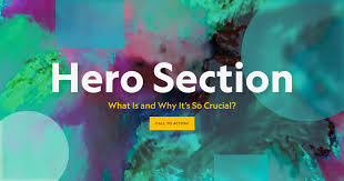
Hero Section
Definition
The large banner area below the header that serves as the primary value proposition showcase, designed to immediately communicate what the page offers.
Typical Composition
- Background image/video with overlay
- Clear headline (h1 tag)
- Supporting subheadline
- Primary call-to-action button
Design Principles
- Above-the-fold critical content
- Strong visual hierarchy
- Optimized loading performance
- Responsive behavior
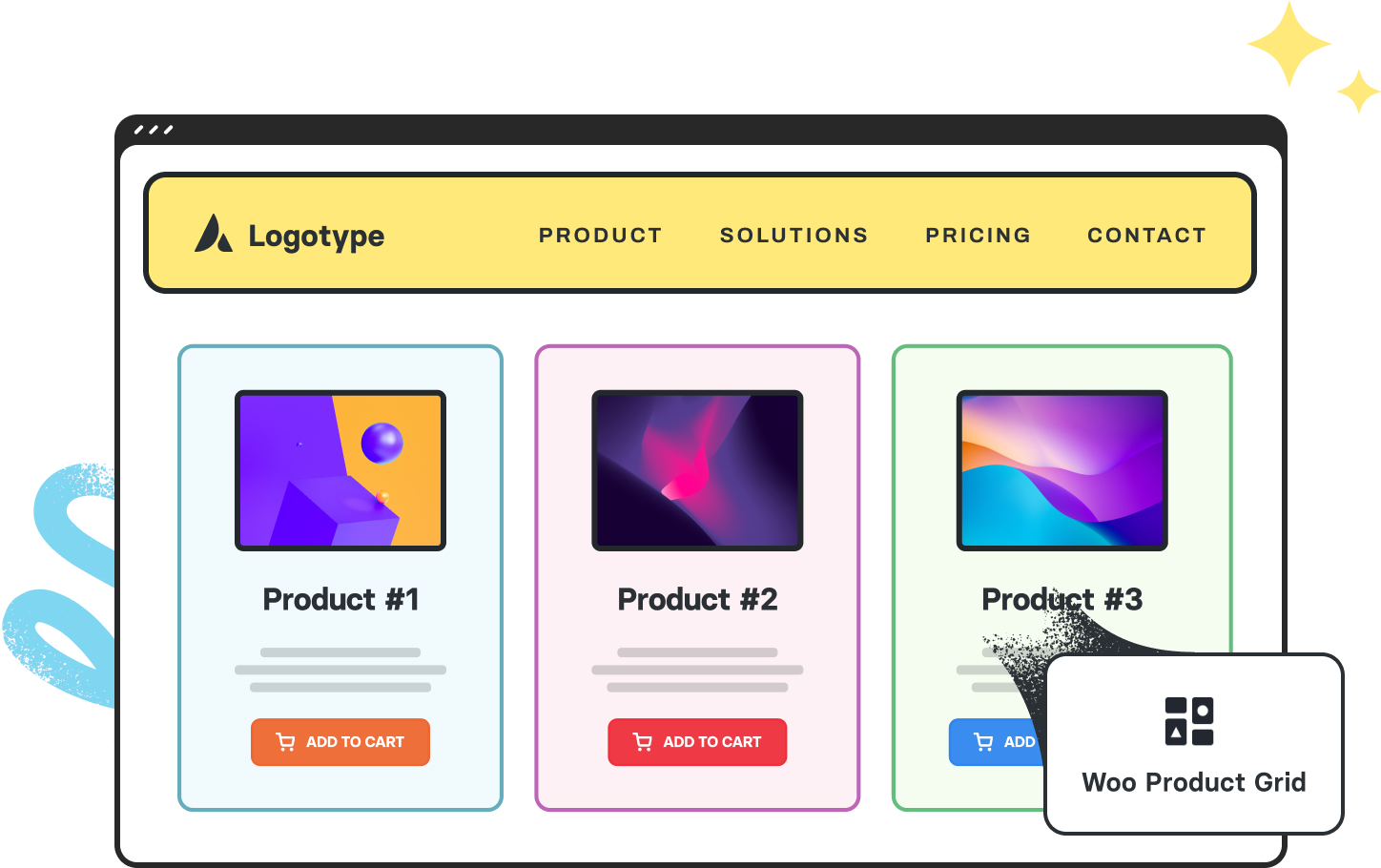
Grid Section
Definition
Grid sections use CSS Grid or Flexbox to create organized layouts that present content in a structured, visually balanced way. They're particularly effective for displaying collections of similar items like products, services, or portfolio pieces. Grid layouts establish clear visual relationships between items while maintaining consistent spacing and alignment.
When to Use Grid Layouts
- Displaying multiple items of equal importance - Showcase elements with similar weight in your content hierarchy
- Creating visual consistency - Maintain uniform spacing and alignment
- Responsive design needs - Adapt layouts across different screen sizes
- Image-heavy content - Galleries, portfolios, or product displays
- Comparative information - Quick feature/option comparisons
Grid Layout Best Practices
Visual Consistency
Maintain uniform spacing between grid items using consistent gap sizes. This creates rhythm and improves scanability. Consider using a spacing scale (like 4px, 8px, 16px) for harmonious proportions.
Responsive Behavior
Design your grid to adapt to different viewports. A common pattern is reducing columns on smaller screens (e.g., 4 columns on desktop → 2 columns on mobile). Always test your grid at various breakpoints.
Content Prioritization
Not all grid items need equal prominence. Use techniques like spanning items across multiple columns or increasing their size to highlight important content while maintaining grid structure.
Accessibility
Ensure your grid remains navigable and readable for all users. Maintain proper heading hierarchy, sufficient color contrast, and logical tab order regardless of visual layout.
Implementation Tips
- Start mobile-first: Design single-column layout first, then enhance for larger screens
- Use semantic HTML: Wrap grid items in
articleorsectionelements - Consider aspect ratios: Maintain consistent image proportions
- Add interaction cues: Include hover/focus states
- Test with real content: Ensure grid works with varying content lengths
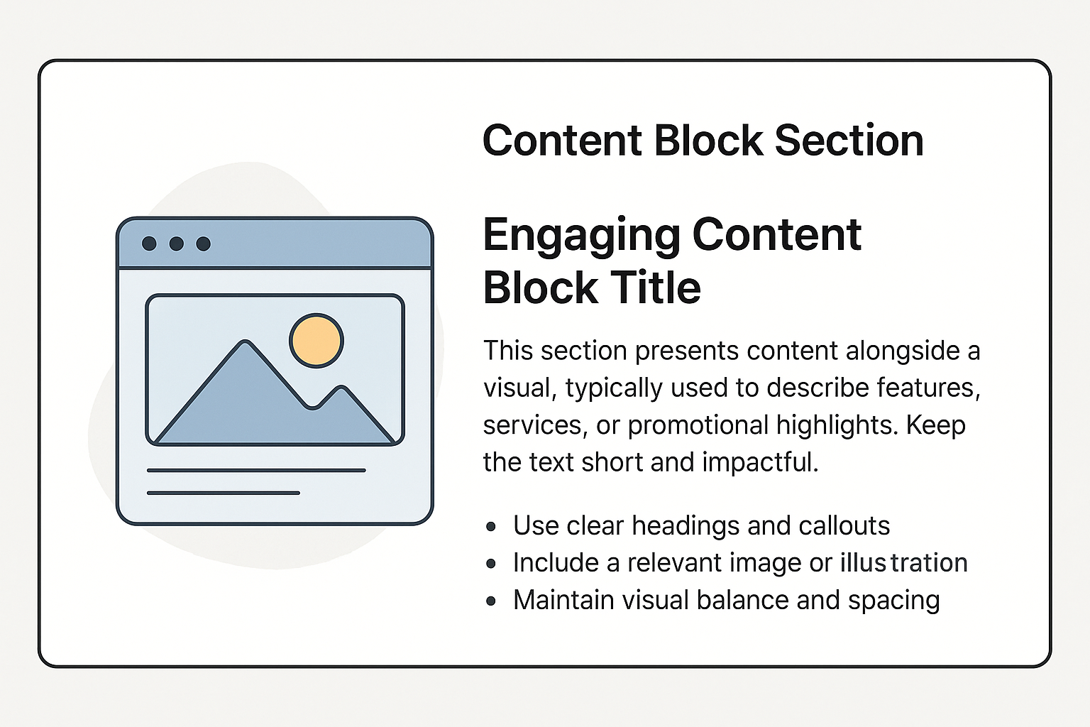
Content Blocks
Definition
Content blocks are the building blocks of modern web design - self-contained, modular sections that organize information into clear, focused units. Like paragraphs in a well-structured document, each block presents a single idea or piece of content, making complex information easier to digest and navigate.
Why Use Content Blocks?
- ✓Break down complex information into manageable pieces
- ✓Create visual rhythm and improve readability
- ✓Allow for flexible content reorganization
- ✓Enhance mobile responsiveness
Key Characteristics
- •Clear visual separation from other content
- •Self-contained with all related elements
- •Consistent styling across similar blocks
- •Logical content grouping
Common Content Block Types
Feature Blocks
Highlight product features or services with icons, headings, and concise descriptions.
Testimonial Blocks
Showcase customer feedback with quotes, names, and optional photos.
Statistic Blocks
Present key metrics or achievements with large numbers and context.
Call-to-Action (CTA) Buttons
Definition
Call-to-Action buttons are the signposts of your website - strategically placed elements that guide users toward your most important conversions. These visual prompts tell visitors exactly what action to take next, whether it's making a purchase, signing up for a service, or downloading content.
Why CTAs Matter
- ✓Direct users toward conversion goals
- ✓Create clear paths through your content
- ✓Improve user experience by reducing decision fatigue
- ✓Provide measurable interaction points
Key Characteristics
- •Visually distinct from other elements
- •Use action-oriented verbs (Get, Start, Join, etc.)
- •Appropriate size for visibility and touch targets
- •Strategic placement in the visual hierarchy
CTA Types & Examples
Primary CTAs
The main conversion driver on a page. Should be most prominent.
Secondary CTAs
Alternative actions that support the primary conversion.
Best Practices
1. Clear Action Language
Use strong verbs that create urgency or benefit: "Get Started", "Claim Your Discount", "Book Your Spot Today".
2. Visual Contrast
Make CTAs stand out with contrasting colors. The best performing buttons often use colors not found elsewhere on the page.
3. Strategic Placement
Position CTAs where users naturally look: after value propositions, at the end of sections, and in sticky headers/footers.
4. Size & Spacing
Ensure buttons are large enough (minimum 44×44px for touch) with ample whitespace around them.
Key Takeaways
- Modular Design: Each section serves a distinct purpose while contributing to the whole
- Semantic HTML: Proper use of elements like
<header>,<section>, and<footer>improves accessibility and SEO - Responsive Considerations: All sections should adapt gracefully to different screen sizes
- Visual Hierarchy: Clear structure guides users through your content effectively
- Performance: Optimize media and code for fast loading times