Mastering CSS Units: From Pixels to Viewports
by Gokila Manickam
CSS units play a fundamental role in web development as they determine the size, spacing, and positioning of every element on a webpage. Selecting the appropriate unit is crucial for crafting layouts that are not only visually consistent but also responsive across various screen sizes and devices.
Mastering CSS units allows developers to build interfaces that are both flexible and accessible, ensuring a seamless user experience.
Types of CSS Units
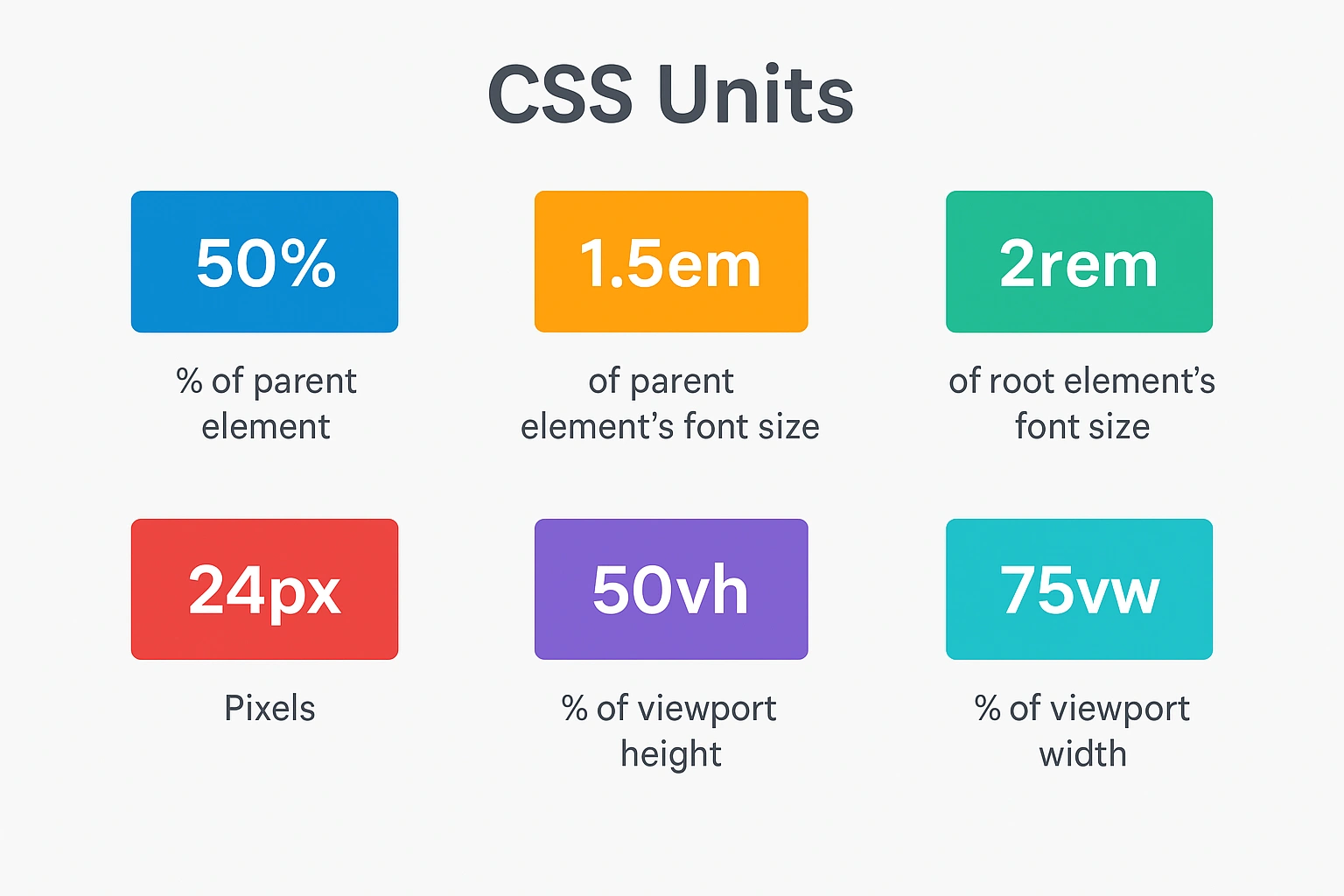
CSS units fall into two main categories:
- Absolute units: Fixed values that don’t adapt to their surroundings.
- Relative units: Flexible values that scale based on their context (like parent size or viewport).
Absolute Units
Pixels (px)
A pixel is the smallest unit of a digital image or screen display. It’s a tiny square of color that, when combined with many others, creates the images and layouts you see on your screen. It does not scale based on the parent element or screen size, making it ideal for fixed, precise layouts.
- Use Case: Use Case: Ideal for elements that require fixed dimensions like borders, icons, or buttons.
.card {
  padding: 20px; /* Always 20 pixels */
  border: 2px solid #ccc; /* Always 2 pixels */
}
Relative Units
Relative units adapt based on their surrounding context, which makes them ideal for responsive design.
Percentage (%)
The '%' unit sets a value relative to the parent container. It is commonly used for width, height, margin, and padding to achieve fluid layouts.
- Use Case: Best for making layouts that adjust to the size of their container.
.container {
width: 80%; /* 80% of the parent width */
height: 50%; /* 50% of the parent height */
}
Em (em)
The em unit is relative to the font size of the parent element. If no font size is defined on the parent, it inherits from the next closest ancestor with a defined size.
- Use Case: Useful for scaling text and spacing based on the parent’s font size, especially in nested components.
.parent {
font-size: 18px;
}
.child {
font-size: 1.5em; /* 1.5 × 18px = 27px */
}
Rem (rem)
The rem unit is based on the font size of the root <html> element. This ensures consistent scaling across the entire document.
- Use Case: Ideal for setting global font sizes, spacing, and layout consistency.
html {
font-size: 16px;
}
h1 {
font-size: 2rem; /* 2 × 16px = 32px */
}
Viewport Width (vw)
The vwunit is relative to the width of the browser viewport. 1vw is equal to 1% of the total width of the browser window.
- Use Case: Perfect for scalable headings, full-width banners, and responsive containers.
.hero-title {
font-size: 5vw; /* 5% of the viewport width */
}
Viewport Height (vh)
The vh unit is based on the height of the viewport. 1vh equals 1% of the browser window height.
- Use Case: Useful for full-screen sections, modals, or vertically centered layouts.
.fullscreen-section {
height: 100vh;
}
Example Use Cases (Conceptual)
1. em vs. rem
emscales relative to the parent element's font size.remscales based on the root (html) font size.- Great for understanding nested scaling vs. global scaling.
<!DOCTYPE html>
<html lang="en">
<head>
<meta charset="UTF-8" />
<meta name="viewport" content="width=device-width, initial-scale=1.0" />
 <title>em vs rem</title>
<style>
html {
font-size: 16px;
}
body {
font-family: sans-serif;
padding: 2rem;
}
.parent-em {
font-size: 20px;
margin-bottom: 1rem;
}
.child-em {
font-size: 1.5em;
}
.text-rem {
font-size: 2rem;
}
</style>
</head>
<body>
<div class="parent-em">
<p class="child-em">Text using em (30px)</p>
</div>
<p class="text-rem">Text using rem (32px)</p>
</body>
</html>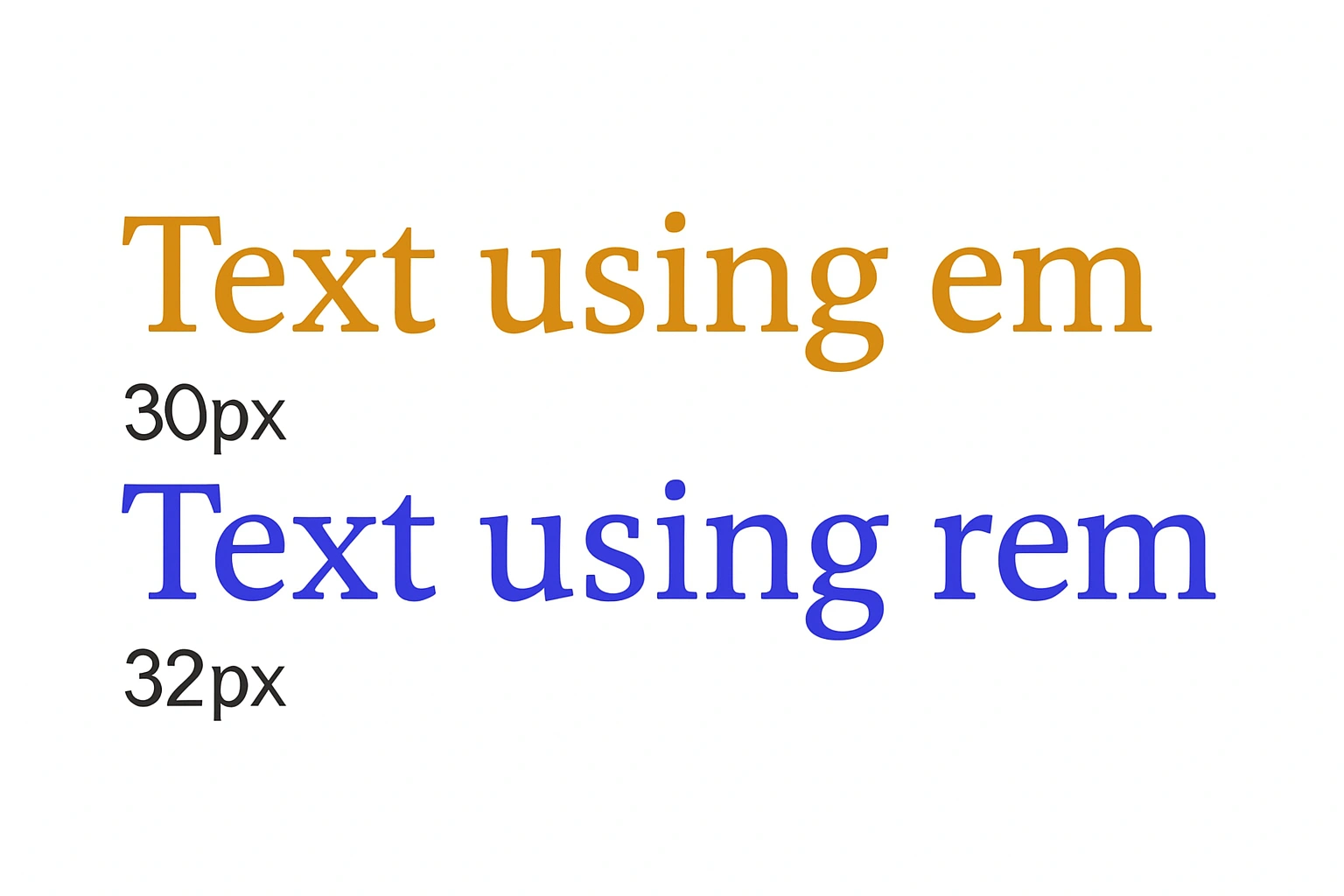
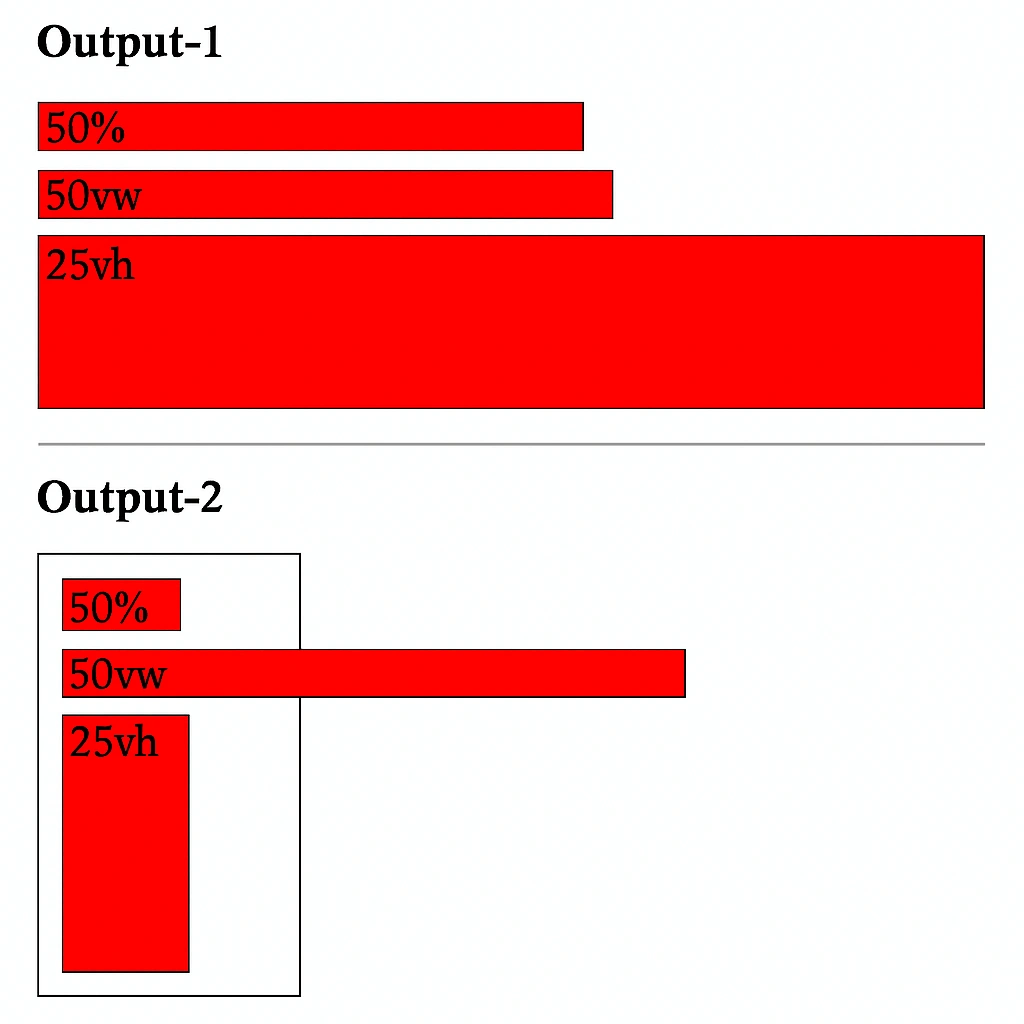
2. Viewport Units (vw and vh)
vwallows widths to respond to the viewport size.vhmakes sections fill or respond to vertical height.- Ideal for hero sections or mobile-friendly banners.
<!DOCTYPE html>
<html lang="en">
<head>
    <meta charset="UTF-8">
    <meta name="viewport" content="width=device-width, initial-scale=1.0">
    <title>CSS Units Example</title>
    <style>
        .unit-box {
            background: red;
            border: 1px solid black;
            margin: 10px;
        }
        .container-box {
            background: white;
            border: 1px solid black;
            width: 100px;
            padding: 10px;
        }
        .width-50-percent {
            width: 50%;
        }
        .width-50-vw {
            width: 50vw;
        }
        .height-25-vh {
            height: 25vh;
        }
    </style>
</head>
<body>
    <h3>Output-1</h3>
    <div class="unit-box width-50-percent">50%</div>
    <div class="unit-box width-50-vw">50vw</div>
    <div class="unit-box height-25-vh">25vh</div>
    <hr>
    <h3>Output-2</h3>
    <div class="container-box">
        <div class="unit-box width-50-percent">50%</div>
        <div class="unit-box width-50-vw">50vw</div>
        <div class="unit-box height-25-vh">25vh</div>
    </div>
</body>
</html>
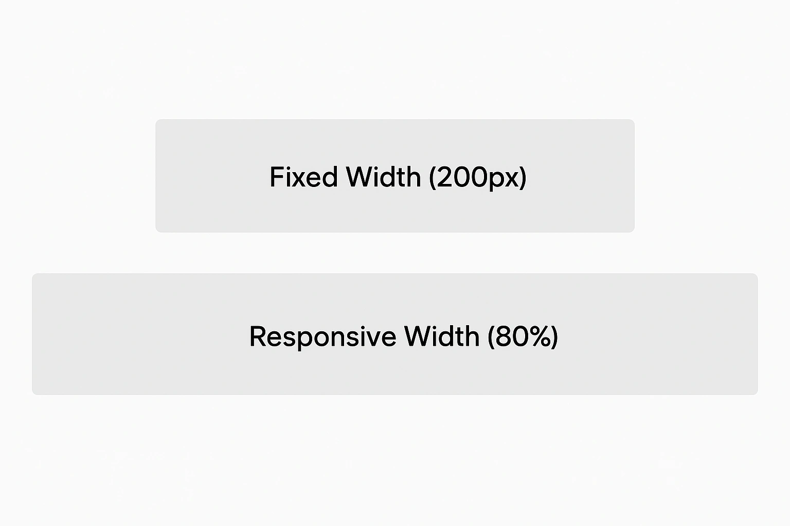
3. Pixels (px) vs. Percentages (%)
pxoffers pixel-perfect control but isn’t responsive.%provides fluid layouts that adapt to different screen widths.
<!DOCTYPE html>
<html lang="en">
<head>
<meta charset="UTF-8" />
<meta name="viewport" content="width=device-width, initial-scale=1.0" /> <title>Pixels vs Percentages</title>
<style>
body {
font-family: sans-serif;
padding: 2rem;
}
.box-px {
width: 200px;
height: 200px;
background: #ccc;
margin-bottom: 16px;
padding: 1rem;
}
.box-percent {
width: 80%;
height: 200px;
background: #aaa;
padding: 1rem;
}
</style>
</head>
<body>
<div class="box-px">Fixed Width (200px)</div>
<div class="box-percent">Responsive Width (80%)</div>
</body>
</html>
Conclusion
Mastering CSS units is crucial for building layouts that are both responsive and visually stable. Use absolute units like px when fixed measurements are needed. For flexible, scalable designs, rely on relative units such as % , em , rem , vw , and vh .
Each unit has its strengths — from maintaining consistent typography to adapting layouts for different screen sizes. Understanding how and when to use them helps create more accessible, adaptable, and effective web designs.